


CI / BI

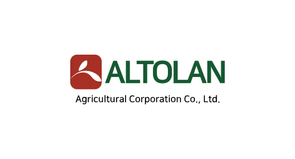
ALTOLAN's CI reflects the value of healthy food gifted by nature and
the abundance of harvest.
The red symbolizing the sun, the grain-shaped mark, and the green
representing mountains and fields are harmoniously expressed to convey
the identity of an agricultural company growing together with nature.
It also embodies ALTOLAN's philosophy of providing a healthy food culture to customers based on fresh ingredients and honest quality.
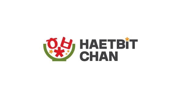
HAETBITCHAN is a food brand that delivers healthy value
to the table based on the goodness of nature and honest quality.
By using a simple and balanced structure, we secured high recognizability
and usability while modernizing the identity of a trustworthy food brand.
The BI is designed using the initials of the brand name, 'HAETBITCHAN' — 'ㅎ · ㅂ · ㅊ' — and incorporates the shape of a bowl to express the brand identity.
The point elements inside the symbol represent powdered sauces and healthy ingredients, the starting point of HAETBITCHAN products, and convey the process by which ingredients grown by nature are transformed into carefully prepared meals.
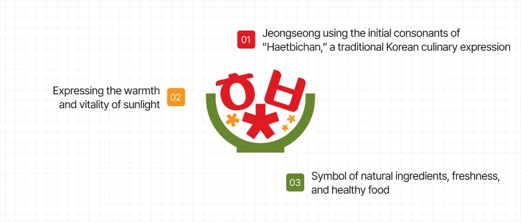
We apply a green color symbolizing nature, a red color symbolizing healthy food, and a yellow color expressing the warmth of sunlight to intuitively communicate the brand's core values: nature, sunlight, and a healthy food culture.